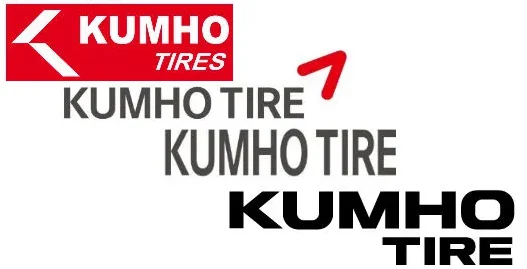
Kumho Tire USA has introduced a new logo in the US market to showcase its dedication to innovation. It looks like the updated logo is already making its way onto everything related to the brand, from marketing materials to product platforms.
The new design reflects Kumho Tire’s commitment to providing top-notch, reliable tires while embracing a modern identity that signifies progress. The logo features a bold typeface for a strong and dynamic feel, aligning with the company’s forward-looking vision. The addition of stacked text offers flexibility in various creative formats, aiding consumer recognition while maintaining the brand’s established identity.
Shawn Denlein, President of Sales and Marketing for Kumho Tire USA, highlighted the company’s belief in delivering high-quality tires that offer great value. He explained, “The new logo represents our forward-looking approach and commitment to innovation, using a bold font and contemporary design to signal our vision for the brand’s future.”

The updated logo incorporates modern elements and a distinctive color palette of black, white, and red, creating a recognizable brand identity. Kumho Tire USA is moving forward with this symbol of innovation, reinforcing its commitment to providing exceptional tires to consumers.


1 thought on “Kumho Tire USA Unveils Refreshed Logo as Symbol of Innovation”